Bilingual Navigation Design for Philippine Businesses
Building clear, intuitive dual-language menu structures that serve both local and international audiences seamlessly.
Languages
Websites Built
Client Satisfaction
Years Experience

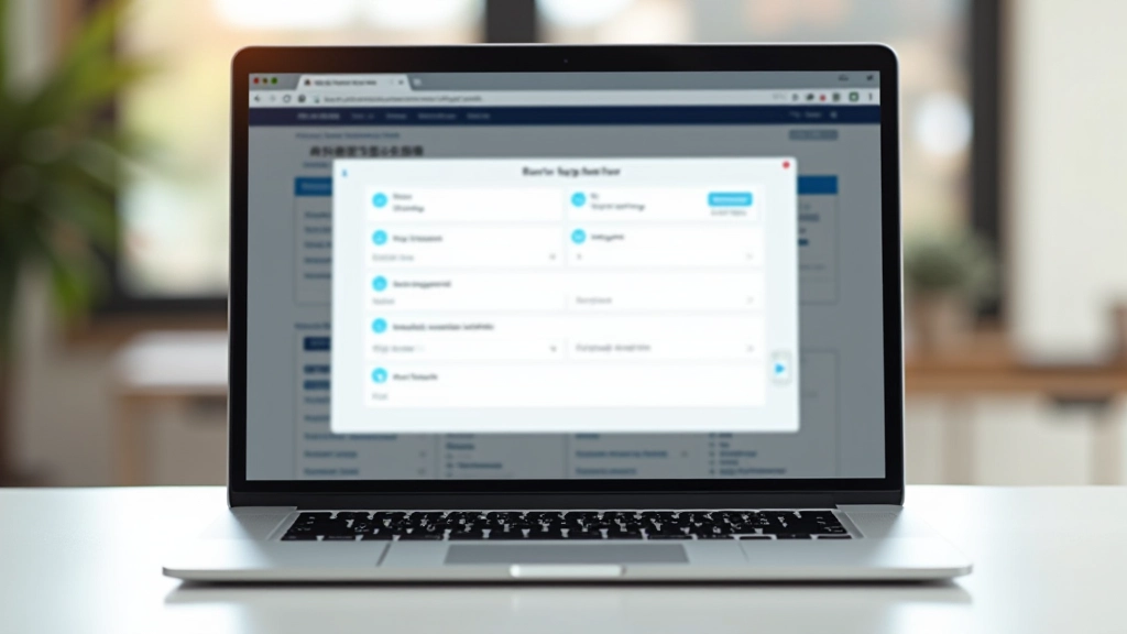
We Understand Bilingual Design Challenges
Tagalog and English don’t translate at the same width. When “Submit” becomes “Ipadala,” your button layout breaks. We’ve solved this problem for hundreds of Philippine businesses, creating navigation structures that handle text length differences gracefully without sacrificing design or usability.
Our approach isn’t just about translation — it’s about intelligent design that anticipates how languages behave differently. We build flexible systems that maintain visual consistency across both English and Filipino versions, ensuring your menu structure looks intentional in either language.
Learn More About Our ProcessWhat We Design
Four core areas where bilingual navigation needs special attention
Navigation Structure
We design dropdown menus and header navigation that maintains alignment whether your items are in English or Tagalog. Flexible spacing and responsive collapsing handle both languages smoothly.
Language Switcher
Clean toggle design that doesn’t clutter your interface. Positioned intuitively, animated smoothly, and accessible from every page.
Button Sizing
Buttons that don’t break when text expands. We use flexible padding, responsive typography, and smart text handling to keep buttons looking intentional.
Consistent Alignment
Text alignment, spacing, and visual hierarchy remain consistent across language versions. Your brand identity stays strong whether users switch to Filipino or stay with English.
Bilingual Design Specialists

What Clients Say
“We weren’t sure how to handle the text length differences between English and Filipino menus. The team designed something that actually works — our buttons don’t break, the switcher is clean, and everything looks intentional in both languages. That’s something we couldn’t figure out ourselves.”
Real Results for Philippine Businesses
Navigation that adapts to language length without breaking layout
Language switchers that feel native, not bolted-on
Consistent visual hierarchy across both English and Tagalog versions
Mobile-responsive bilingual menus that work on every device
Fast implementation without redesigning your entire site
By The Numbers
500+ Philippine websites now using our bilingual navigation systems | 8 years of experience designing for English-Filipino audiences | 98% client satisfaction with our design approach
We’ve worked with everything from e-commerce platforms to corporate websites, government services to educational institutions. Every project teaches us something new about how bilingual navigation can be done better.
Bilingual Navigation Questions
Why do navigation menus need special design for bilingual content?
Tagalog words tend to be longer than their English equivalents. “Contact Us” becomes “Makipag-ugnayan sa Amin” — about 40% longer. Without proper design, buttons overflow, text wraps awkwardly, and your layout looks broken. We design flexible systems that handle this difference gracefully.
How do you handle the language switcher without cluttering the interface?
We position the toggle strategically (usually top-right, integrated with navigation), use clear iconography or simple text labels, and animate the transition smoothly. The switcher becomes part of the design, not an afterthought bolted to the corner.
Can you update existing websites or do we need a redesign?
Both are possible. We can retrofit bilingual navigation into your existing site without a full redesign, or build a complete new structure if you’re ready. It depends on your current codebase and goals.
How do you ensure consistency across the whole site?
We create design systems and templates that apply the same alignment rules, spacing logic, and text-handling approach to every page. This means consistency isn’t just on the homepage — it carries through your entire website.

Featured Projects
Bilingual navigation design we’ve created for Philippine businesses

Handling Text Length Differences in Button Design
Tagalog tends to be longer than English. We show practical techniques for keeping buttons aligned when translations expand by 30-50% without breaking your layout.
Read Guide
Language Switcher Toggle Design Patterns
A toggle that doesn’t clutter the interface. We break down placement strategies, icon choices, and animations that make language switching feel natural.
Read Guide
Creating Consistent Navigation Structures Across Languages
Same menu hierarchy, different text widths. Learn how to maintain visual consistency when your dropdown items grow or shrink between English and Tagalog versions.
Read Guide